Website design falls into a few main types, and each one is built around a different goal. Static websites use fixed pages and suit simple business profiles. Dynamic websites pull content from a database, so they handle blogs, directories, and frequently updated pages. E-commerce websites are made for selling products online. Responsive websites adjust automatically to any screen size, from phones to desktops. Single-page and landing page designs focus on one clear action, like a sign-up or a call. The right type depends on your budget, how often you update content, and whether your goal is to inform, generate leads, or sell.
Types of Web Designs are:
A static website design uses fixed HTML, CSS, and sometimes a little JavaScript to display the same content to every visitor. Each page is a separate file stored on the server, so nothing is pulled from a database or changed on the fly. When someone opens the page, the browser simply loads the file exactly as it was built. If you want to change the text or an image, a developer has to edit the code and upload the file again.
Static sites are the oldest and simplest form of web design, and they are still a smart choice for the right project. Because there is no database or server-side processing, they load quickly and have far fewer security weak spots than most dynamic setups.
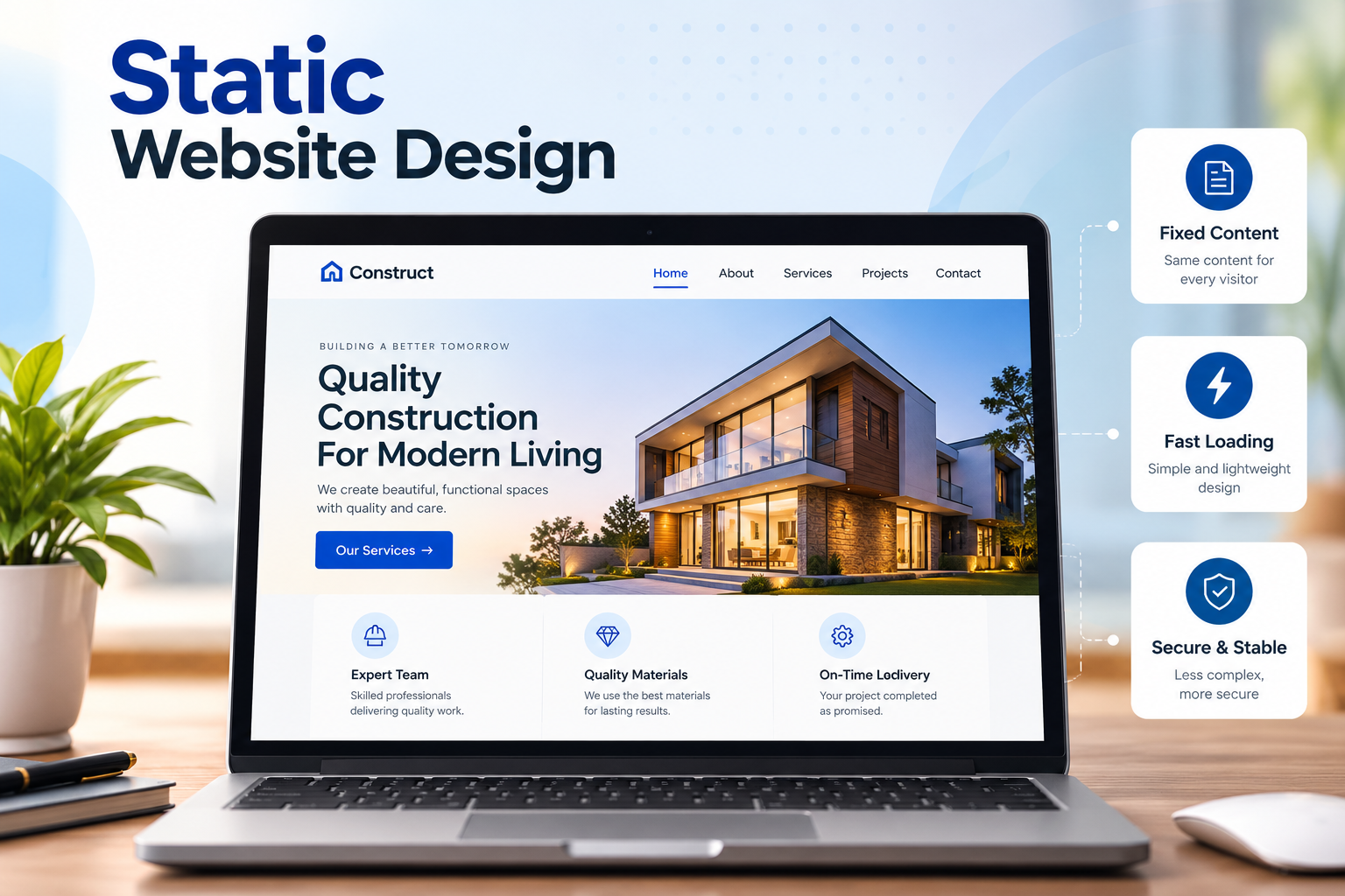
If you need a simple online presence with only a handful of pages, a static site is a good fit. It works well for portfolios, small business profile sites, event pages, and landing pages that rarely change. But if you plan to publish blog posts every week or sell products, a dynamic or e-commerce design will serve you better.
A dynamic website design generates pages on the fly by pulling content from a database. Instead of storing every page as a fixed file, the server builds each page when a visitor requests it, using templates and stored data. This means the content can change based on who is visiting, what they searched for, or what the site owner updated that day.
Most of the modern web runs on dynamic design. Blogs, news sites, directories, membership platforms, and booking systems all rely on it because they need to publish and update content often without rebuilding the site by hand.
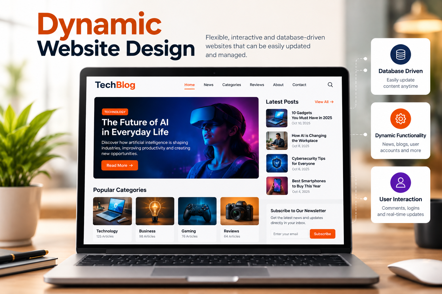
If you plan to publish content regularly, manage many pages, or offer features like user accounts and online bookings, a dynamic site is the better fit. It works well for blogs, service businesses with growing content, directories, and membership sites. But if you only need a few pages that rarely change, a static design will be faster, cheaper, and easier to secure.
A single page website design puts all of its content on one continuous page instead of spreading it across multiple URLs. Visitors scroll down to move through sections like the intro, services, testimonials, and contact details, or click a menu that jumps them to each section. Everything loads at once, so the experience feels smooth and focused.
This design works best when you want visitors to follow one clear path and take one clear action, such as booking a call, signing up, or downloading an app.
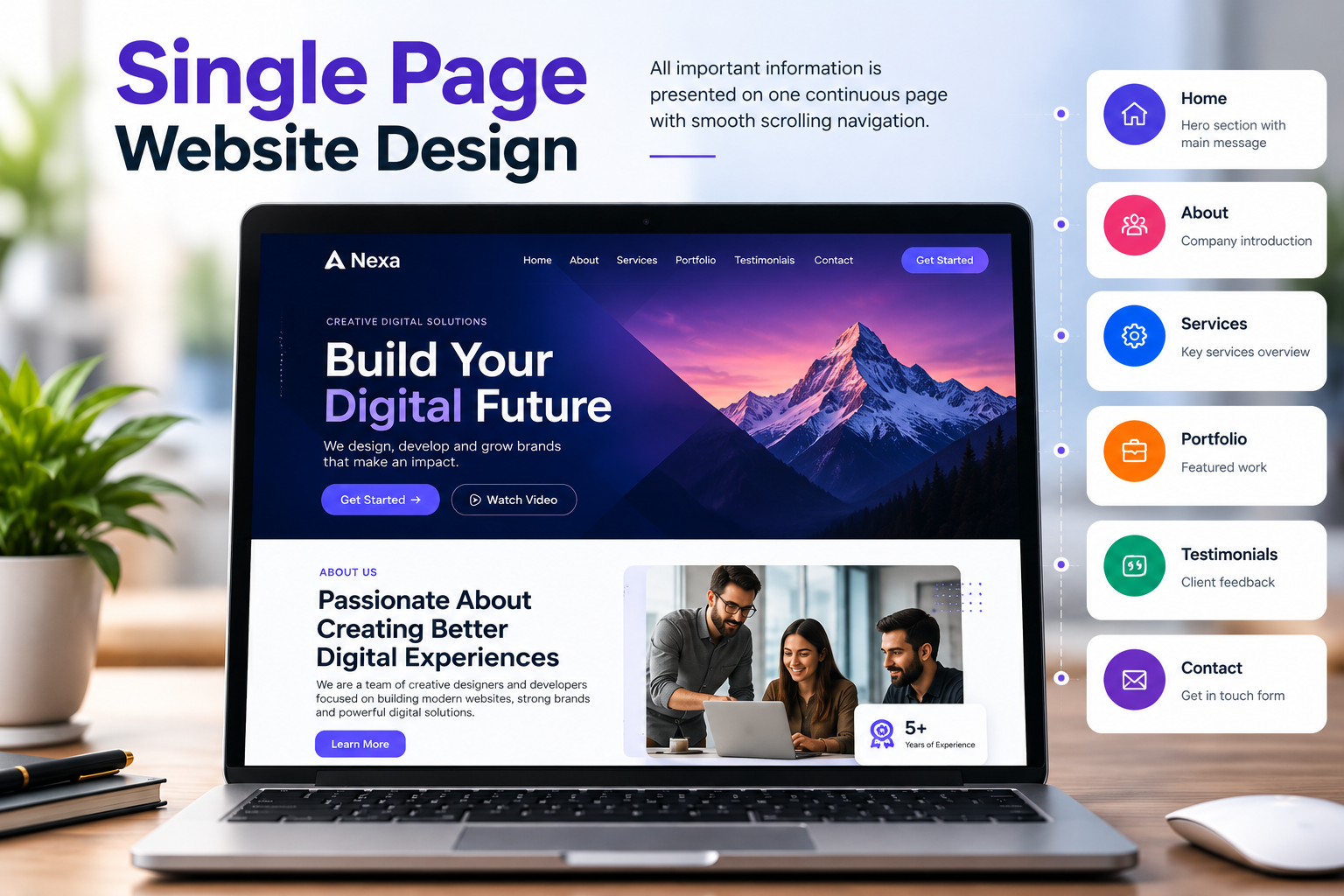
If you run a small business, freelance service, event, app launch, or personal portfolio with a simple message, a single-page site is a good fit. It also works well for campaign landing pages where one action matters most. But if you offer many services, publish blog content, or want to rank for several keywords, a multi-page dynamic site will give you more SEO room.
A fluid website design, also called liquid design, sizes its layout using percentages instead of fixed pixel widths. Columns, images, and containers stretch or shrink in proportion to the browser window, so the page fills the available screen space whether it is viewed on a small laptop or a wide monitor. Nothing is locked to a set width, which makes the layout feel flexible and continuous.
Fluid design was a major step forward from rigid fixed-width layouts. It also laid the groundwork for modern responsive design, which builds on the same proportional approach and adds media queries for more control.
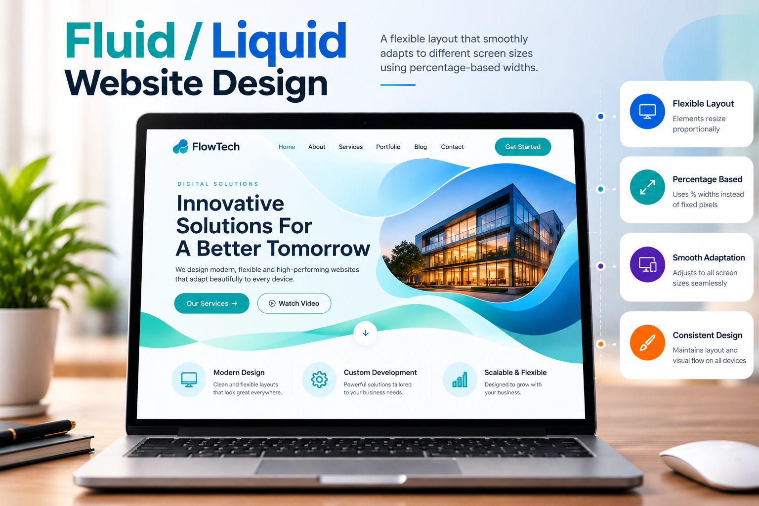
If you want a flexible layout that fills the screen and you mainly expect visitors on laptops and desktops, fluid design is a practical choice. It suits content-heavy sites, dashboards, and web apps where using the full width matters. But if a large share of your traffic comes from phones, a fully responsive design will give you better control and a smoother mobile experience.
A responsive website design automatically adjusts its layout, images, and text to fit the screen it is viewed on. Using flexible grids, scalable images, and CSS media queries, the same site rearranges itself for phones, tablets, laptops, and large desktop monitors. A three-column layout on a desktop, for example, can stack into a single column on a phone, without needing a separate mobile version of the site.
Today, responsive design is the standard approach for most websites. Google uses mobile-first indexing, which means it primarily looks at the mobile version of your pages when deciding how to rank them, so a site that works well on small screens is no longer optional.
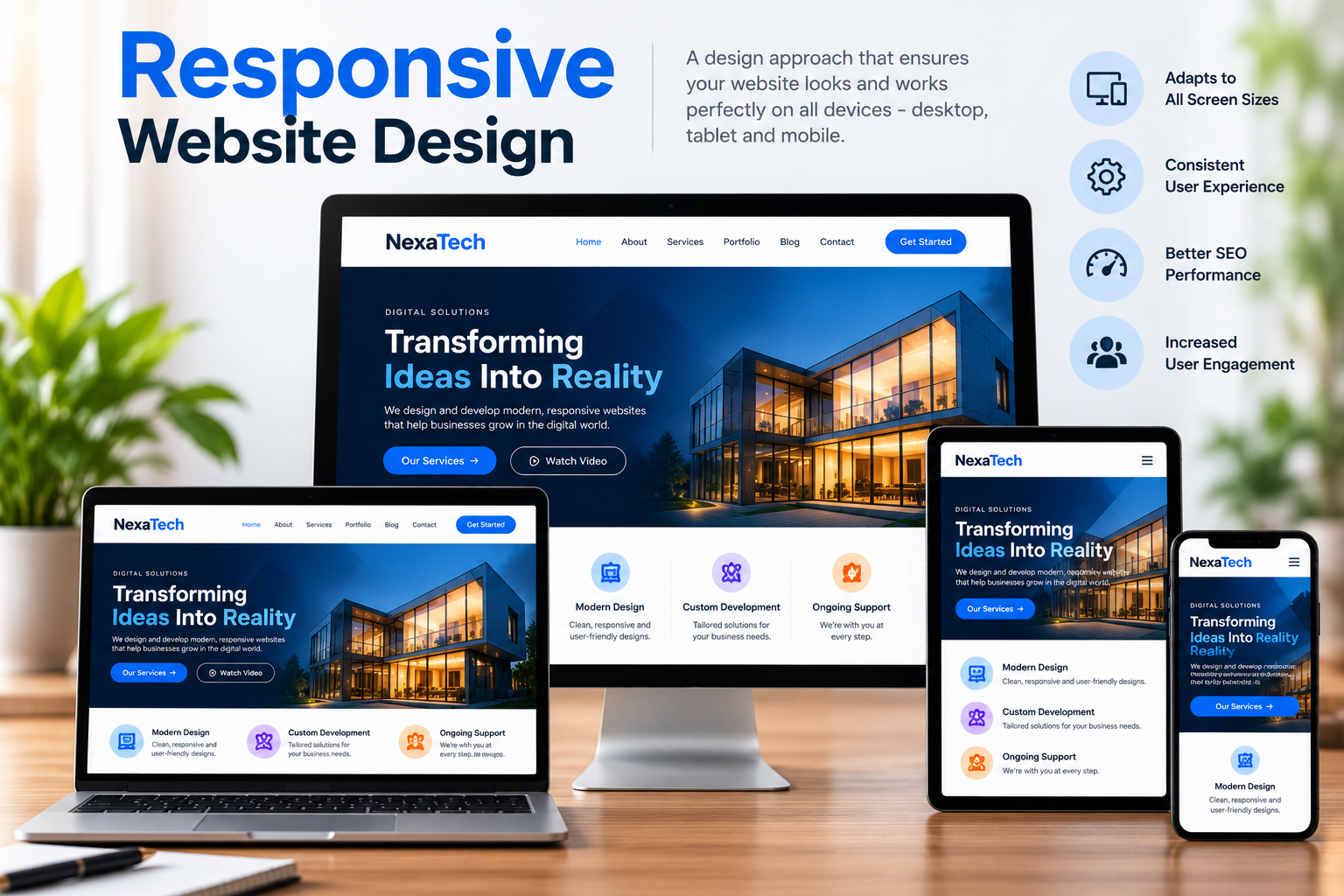
If your visitors come from a mix of phones, tablets, and computers, as they do for almost every business website today, responsive design is the right choice. It works especially well for service businesses, local SEO sites, blogs, and online stores that rely on search traffic. A responsive build is also a good pick if you want one site that is easy to maintain and rank.
An e-commerce website design is built to sell products or services directly online. It combines a browsable catalog, a shopping cart, and a secure checkout so visitors can find an item, pay for it, and track their order without leaving the site. Every design choice, from product page layout to button placement, is made to move the visitor toward a purchase.
E-commerce sites are almost always dynamic, because they rely on a database to manage products, prices, inventory, customer accounts, and orders. Platforms like Shopify, WooCommerce, and BigCommerce handle most of this behind the scenes.
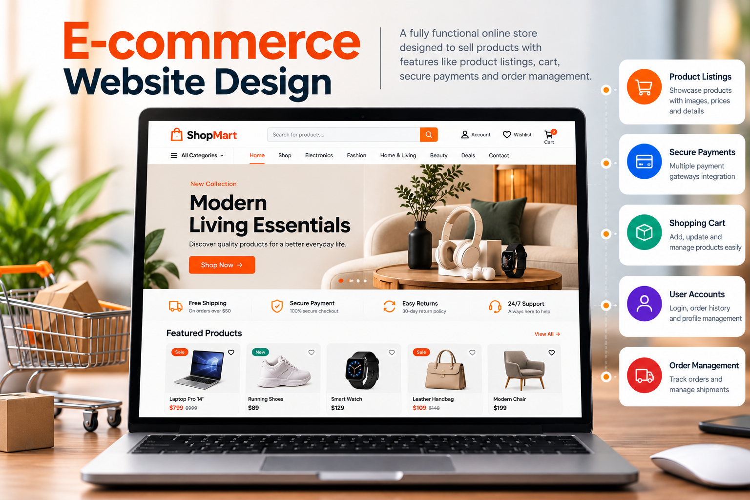
If you sell physical products, digital downloads, or bookable services and want customers to pay online, an e-commerce design is the right fit. It suits retail brands, boutiques, wholesalers, and service providers selling packages. But if you only need to show your work and collect enquiries, a simpler dynamic or single-page site will cost less and be easier to manage.
A minimalist website design strips a page down to only what the visitor needs. It relies on plenty of white space, a limited color palette, clean typography, and a simple layout, so nothing competes with the main message. The goal is clarity: every element on the page has a clear purpose, and anything that does not help the visitor is removed.
Minimalism is a style rather than a technical build type, so it can be applied on top of any of the designs above. A static portfolio, a responsive business site, or an e-commerce store can all use a minimalist approach.
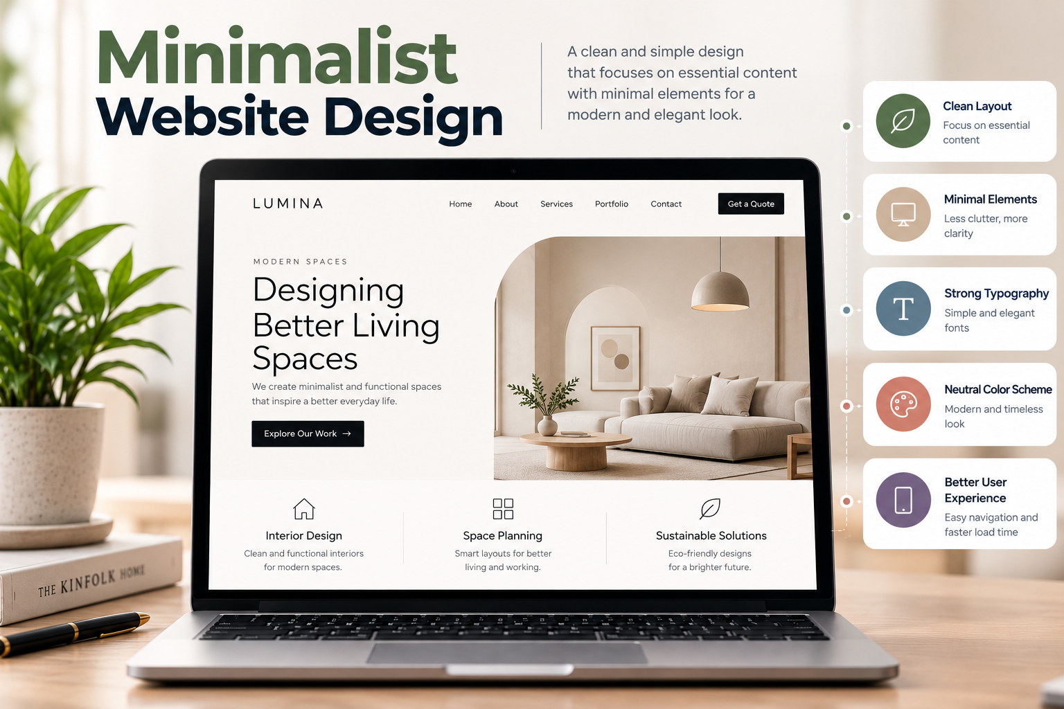
If your goal is to present a clear message, showcase quality work, or guide visitors toward one main action, minimalist design is a strong fit. It suits portfolios, consultants, creative studios, luxury brands, and service businesses with a focused offer. But if you run a content-heavy site such as a large directory or a store with thousands of products, you will need a more structured layout with richer navigation and filters.
The right website design depends on your goal, your budget, and how often you plan to update your content. A static website is a fast, secure, and low-cost choice for simple profiles and portfolios. A dynamic website suits businesses that publish content regularly or need features like logins and bookings. A single-page design keeps visitors focused on one action, while an e-commerce design is the right pick if you want to sell online.
Fluid design laid the groundwork for modern layouts, but responsive design is now the standard, especially because Google uses mobile-first indexing. Minimalist design is a style rather than a build type, so you can apply it on top of any of the others for a cleaner, faster experience.
In most cases, the best approach is to combine them: a dynamic, responsive website with a minimalist look works well for the majority of businesses. Start by defining what you want visitors to do, then choose the design type that supports that goal. If you are unsure, a quick consultation with a web design professional can save you time and rework later.

Founded in 2016, known for the quality services and proven results.
explore moreIn This Article

SEO
Search Engine Optimization, abbreviated as SEO, is a technical method used to optimize websites to improve their ranking in search engine platforms. The very well-known SEO platform is Google. It can be said that SEO works..
Read more >>
Web Development
Web development covers the creativity and management of websites and web applications. It is all about the practical and logical use of high-level languages, frameworks, and tools to create both the client-side..
Read more >>
Web Design
Web design is basically the planning, development, and arrangement of content on websites. It covers the user interface of the website that includes pleasing color patterns, typography, graphics, images, and many elements...
Read more >>Ready To Take Your Company To the Next Gen?

Contact Us
Fill out the contact form, and we’ll be in touch with you soon to learn more about your business.

Project Discussion
After the submission, we discuss strategy, define the scope of work, and recommend the finest solutions.

Launching and maintenance
Once the project is done and launched effectively, we’ll provide maintenance and support to make sure your brand performs well in the digital world.
A Brand Experience Beyond Compare So Contact Us Today

