
Your website may be one of the first places people will see your business. People may judge your business in just seconds. Your website design influences how they perceive your business and what they do next.
Web design is basically the planning, development, and arrangement of content on websites. It covers the user interface of the website that includes pleasing color patterns, typography, graphics, images, and many elements. Effective design promises that a website looks professional and provides a consistent user experience across devices
Web design involves planning a website’s visual appearance, layout, content presentation, navigation, and user interactions. Web design is an interpretation of the vision and objectives of businesses and their users.
Design elements, including layout, information hierarchy, navigation, and interface, will assist people in locating and performing tasks easily on the website. It also helps to create the perception of credibility for businesses and makes valuable information and actions that are easy to use. A good web design involves more than aesthetics; it is about usability, accessibility, and responsive design.
Every well-built website, whatever its type, rests on a handful of core elements. Together they decide how a site looks, how it feels to use, and how well it performs in search. Layout, navigation, visual design, content, speed, and trust all work as one system: if one is weak, the whole experience suffers. Understanding these elements first makes it much easier to judge which type of website design fits your goals.
Layout is the way content, images, and buttons are arranged on a page. Visual hierarchy is the order in which the eye notices those elements, shaped by size, color, contrast, spacing, and position. Together, they decide whether a visitor understands your page in seconds or leaves confused.
First impressions form quickly. In a 2021 Top Design Firms survey of 500 consumers, 38% of first-time visitors said they look at a page's layout or navigational links. Nielsen Norman Group's research adds that people now spend about 57% of their viewing time above the fold, down from 80% in 2010, so the first screen has to carry your main message.
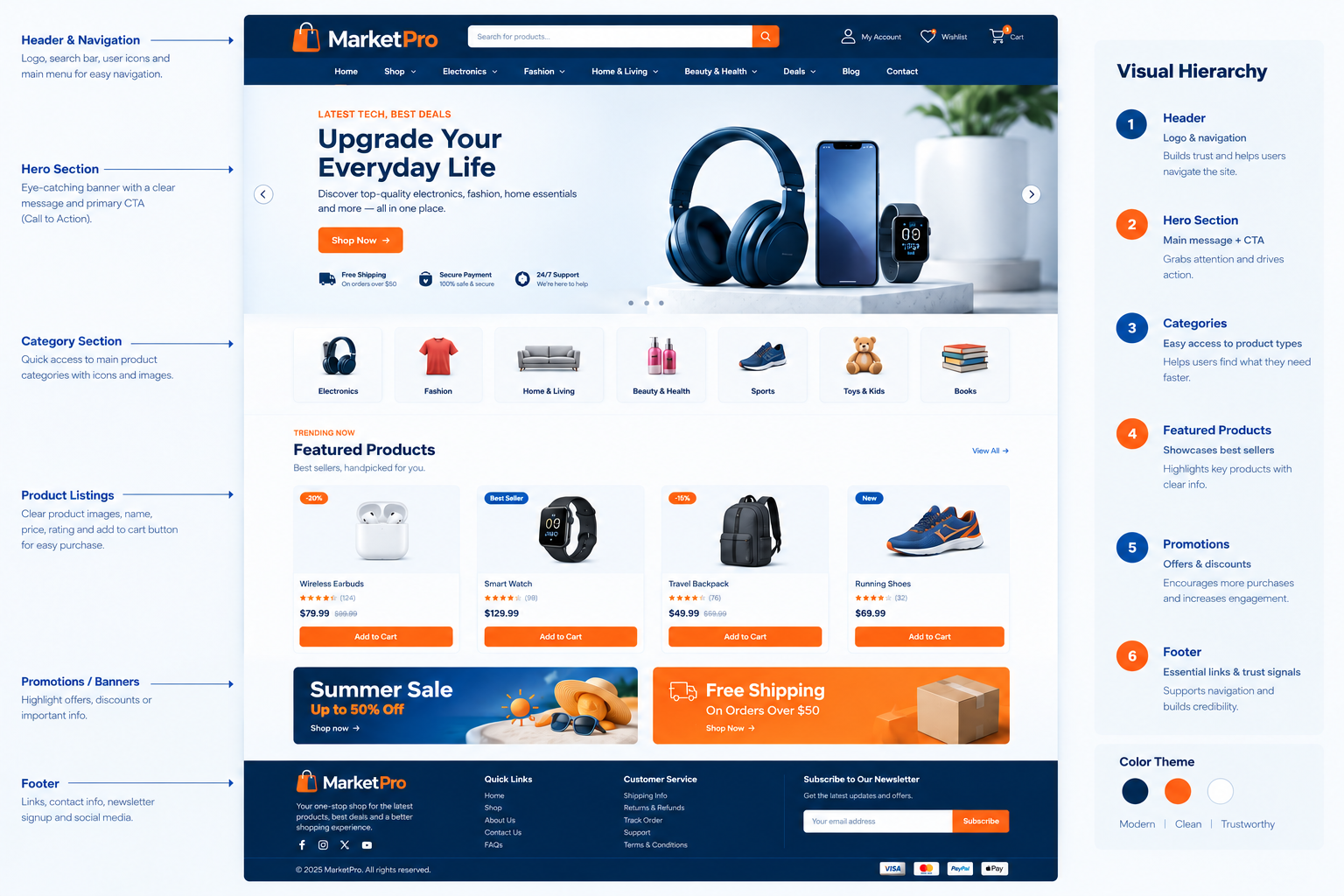
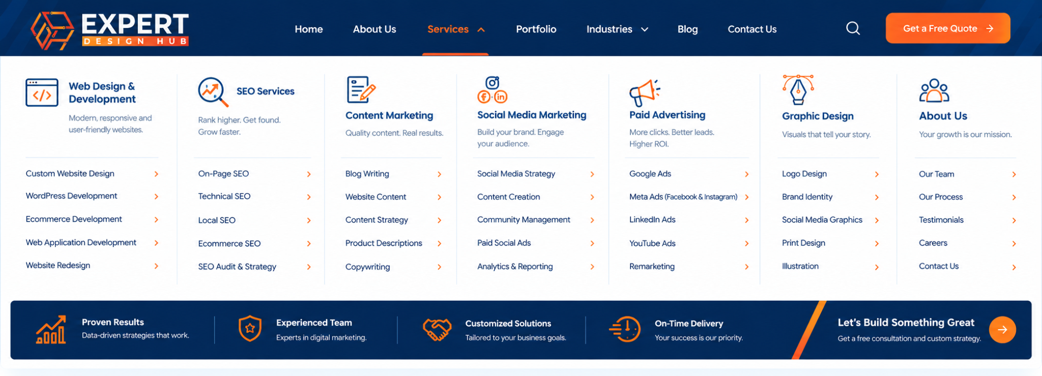
Navigation is the set of menus, links, and buttons that help visitors move around a website. Site structure is the way pages are organized behind the scenes, from the homepage down to categories and individual pages.
Visitors rank this feature first. In a Clutch survey of 612 US respondents, 94% said easy navigation is the most useful website feature. A Nielsen Norman Group study found that content discoverability dropped by more than 20% when navigation was hidden, and it advises against hidden menus such as hamburger icons on desktop.
Google adds that it recommends a naturally flowing hierarchy where every page is reachable through links, without needing internal search.
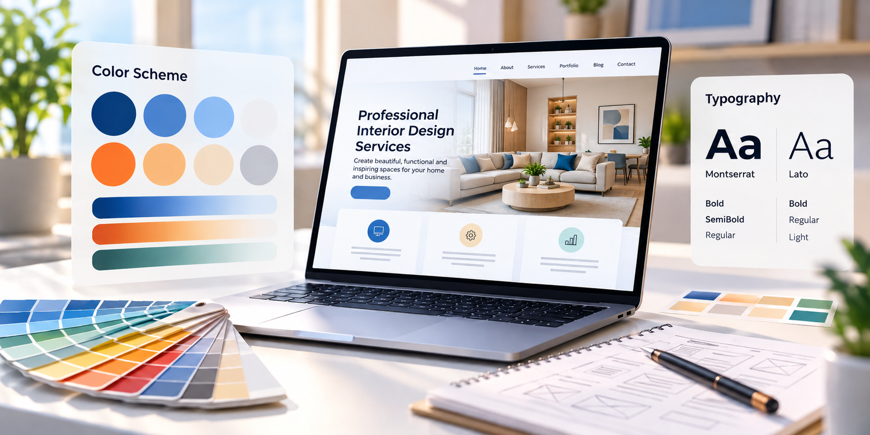
Color and typography set the tone of a website and control how easily visitors can read it. A good palette supports your brand and highlights key actions, while good typography keeps text clear on every screen.
Visitors react to color quickly. In the 2021 Top Design Firms survey of 500 consumers, 22% said they look for eye-catching colors on a first visit, while 21% said they leave a site with outlandish colors. Balance matters more than boldness.
Readability is where most sites fail. WebAIM's 2026 analysis of one million home pages found low-contrast text on 83.9% of them. Stanford's credibility study, with 2,684 participants, found that design look was mentioned in 46.1% of comments about whether a site is believable.
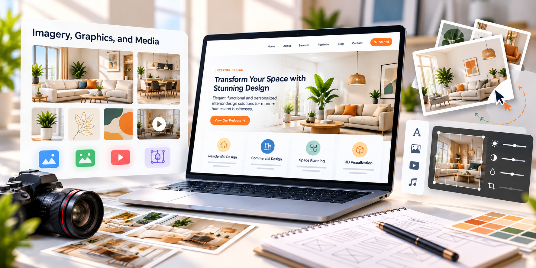
Imagery includes photos, illustrations, icons, video, and graphics. Used well, it shows your product or team, breaks up text, and builds credibility. Used poorly, it slows the page and gets in the way.
Visitors say they value it. In the 2021 Top Design Firms survey, 40% of consumers picked photos and images as the visual element they value most, followed by color at 39% and video at 21%. A Clutch survey found that 91% of respondents consider product descriptions and visuals useful, so images work best alongside clear written details.
Weight matters, though. Google's mobile speed research found that most mobile sites are slow and bloated with too many elements, and WebAIM's 2026 report found missing alternative text on over half of home pages.
Responsive design lets a single website adapt its layout to phones, tablets, and desktops. Mobile-first design goes a step further by planning the small-screen experience first, then expanding it for larger screens.
This is now a search requirement as well as a design choice. Google uses mobile-first indexing, so it primarily uses the mobile version of your site for indexing and ranking. Google's speed research also found that 53% of mobile site visits are abandoned when pages take longer than three seconds to load, which makes mobile performance part of the design itself.
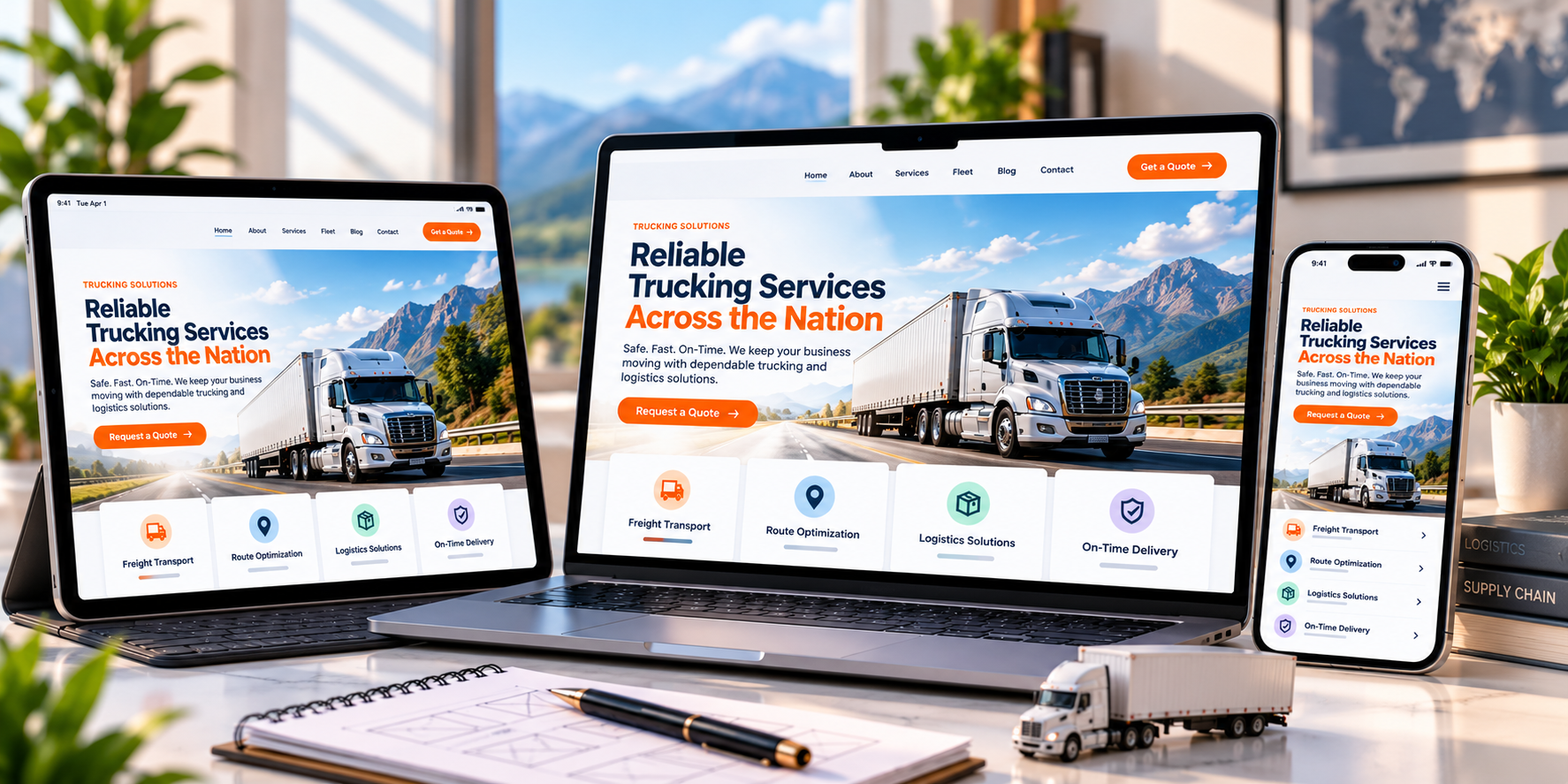
Page speed is how quickly a page loads and becomes usable. It affects user patience, trust, conversions, and search performance, especially on mobile connections .
Surveys show that visitors notice. A Clutch survey of 263 US consumers found that 44% cite a slow website as a reason for distrusting it, and 48% said they wait 10 seconds or less before giving up. Queue-it's 2025 consumer survey found that 50% of consumers are less likely to trust a slow website.
Google's own data points the same way. It found that sites loading in 5 seconds had 70% longer average sessions and 35% lower bounce rates than sites loading in 19 seconds.
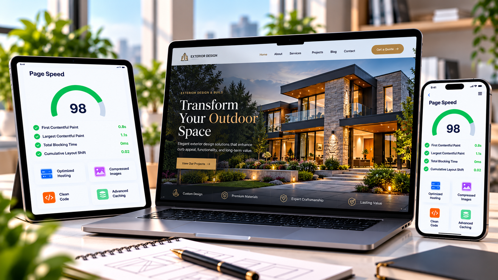
User experience is how easy and pleasant a site is to use. Accessibility makes sure people with visual, hearing, motor, or cognitive disabilities can use it too. They overlap heavily, and good accessibility usually improves UX for everyone.
Real users report the same problems year after year. In WebAIM's 10th Screen Reader User Survey (1,539 respondents, 2023-24), CAPTCHA was the most problematic item, followed by interactive elements like menus and dialogs that do not behave as expected. Businesses are also paying attention: in the Top Design Firms survey, 31% of consumers said user experience should be the top priority in a redesign.
Most sites still fall short. WebAIM's 2026 analysis found WCAG 2 failures on 95.9% of one million home pages, and six error types, including low contrast, missing alt text, and missing form labels, made up 96% of detected errors.
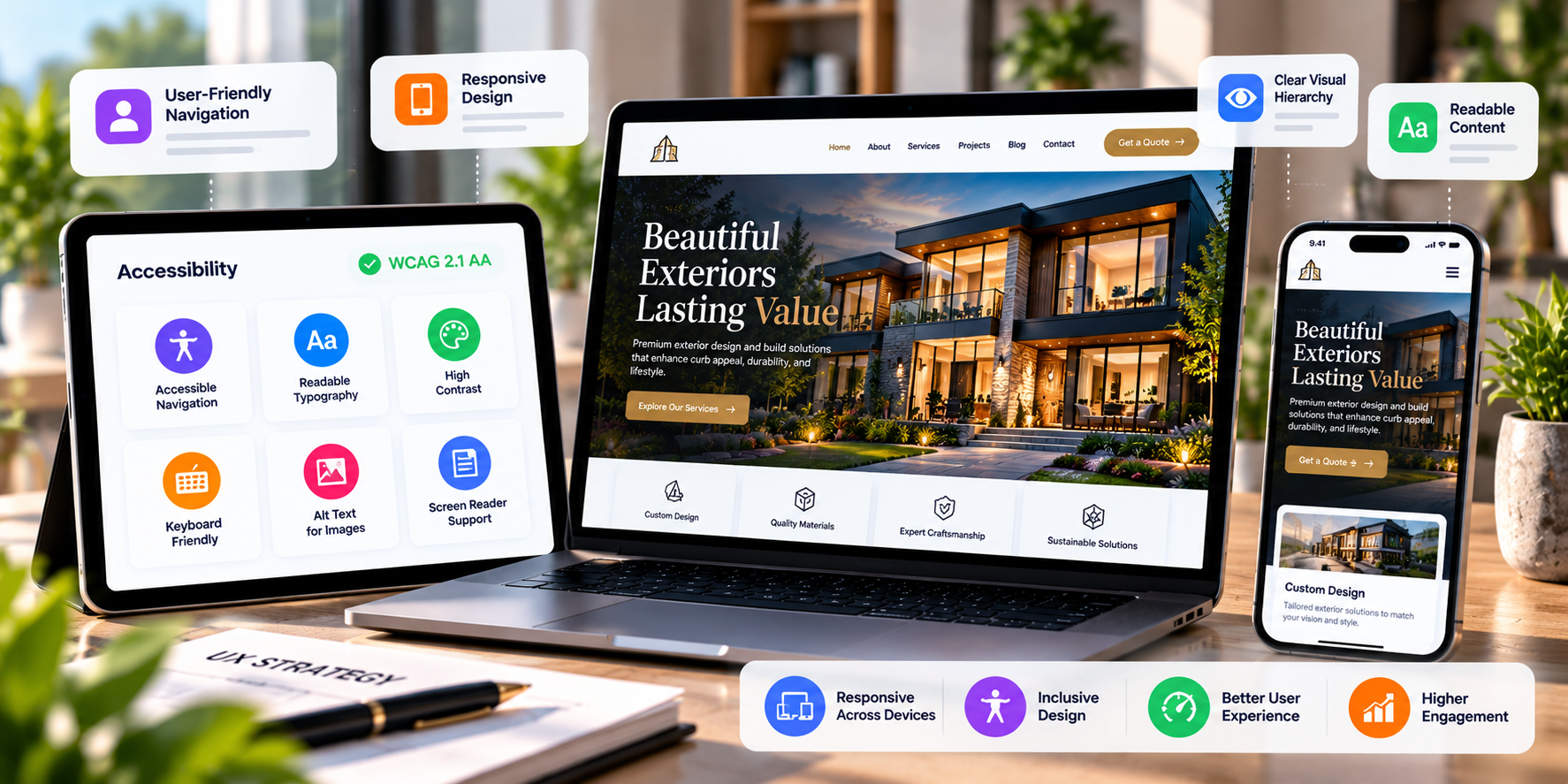
Content is the reason visitors come to a website, and readability decides whether they take it in. Even great information fails if it is buried in long, dense paragraphs.
Relevance comes first. A Clutch survey found that 50% of users will not return to a website if its content is irrelevant. Format matters too: Nielsen Norman Group's classic research found that 79% of test users always scanned new pages and only 16% read word by word, and that highlighting and concise writing improved measured usability by 47 to 58%.
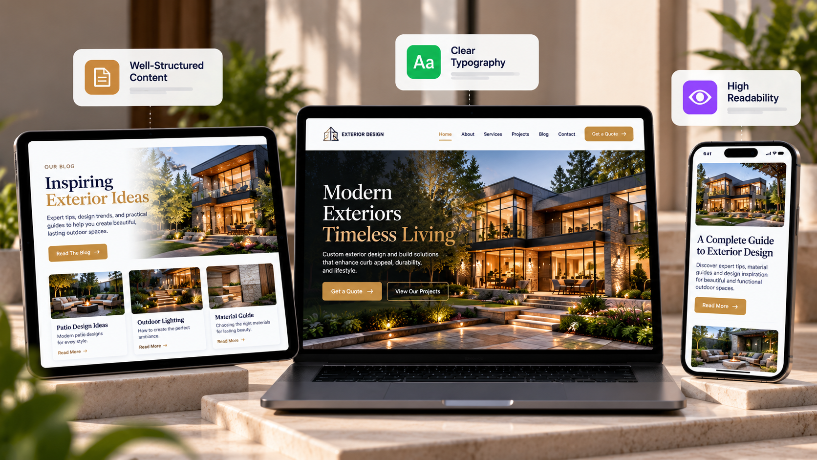
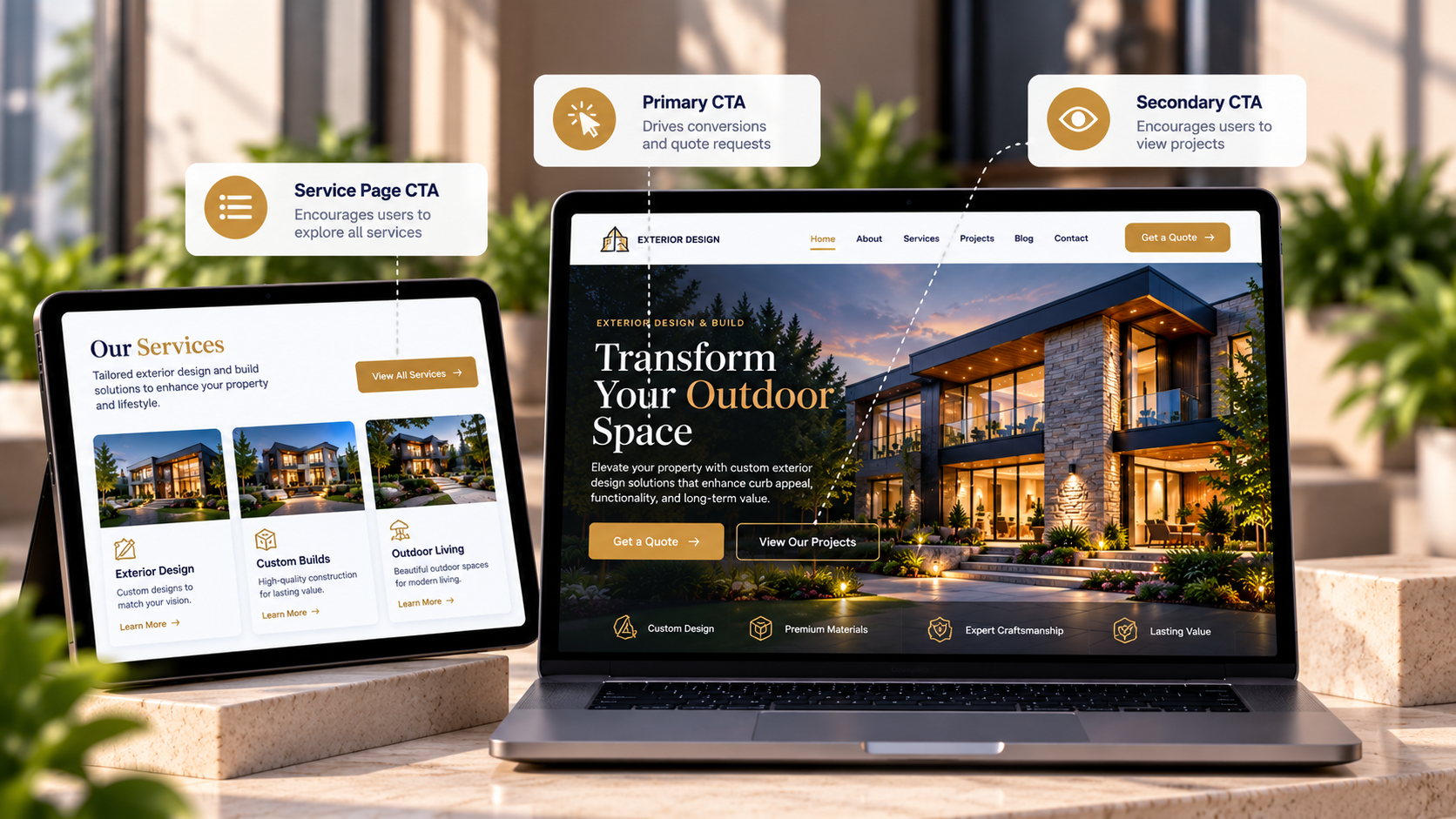
A call to action is the button, link, or form that tells visitors what to do next, such as "Get a Free Quote" or "Book a Call." Without a clear CTA, even interested visitors leave without acting.
Baymard's checkout research shows how much presentation matters. It found that users often overlook options shown as plain text links, so a high-contrast button works better. Its survey also found that 12% of US shoppers abandoned an order because they couldn't see the total cost upfront, a reminder that a CTA works best when the next step feels transparent.
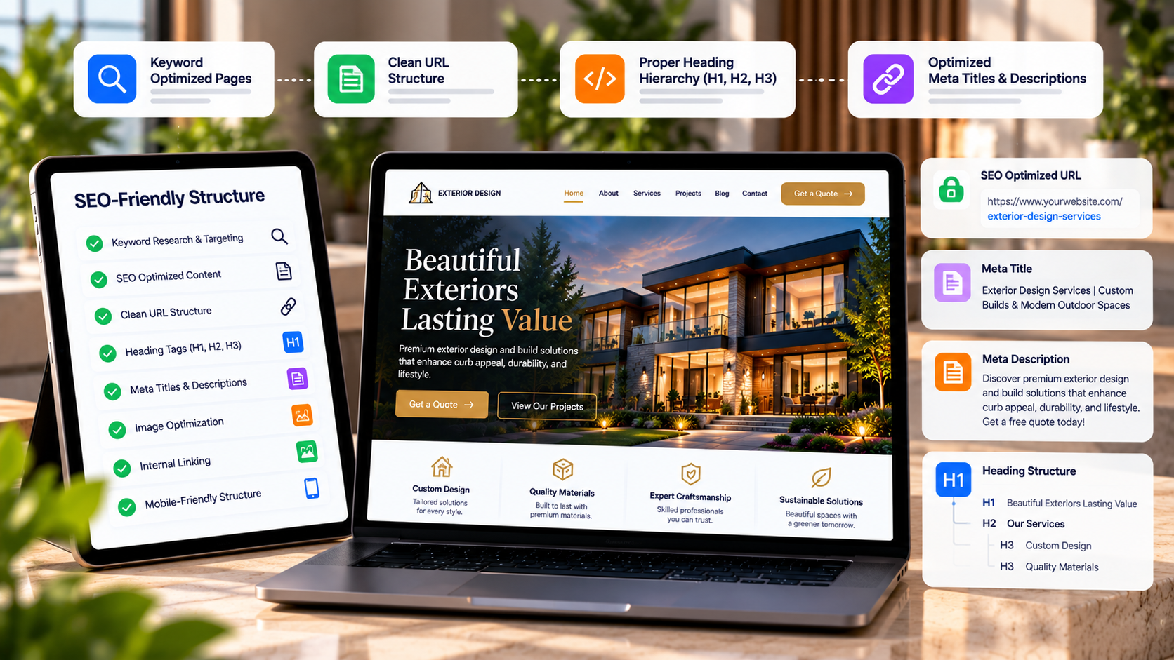
An SEO-friendly website structure helps search engines crawl, understand, and rank your pages. It includes technical foundations like URLs and sitemaps, plus on-page elements like headings and internal links.
Google's own guidance covers the basics. It recommends descriptive URLs that use words useful to users, and an XML sitemap listing relevant URLs with their last modified dates. Google notes a sitemap isn't required, but it helps new and updated pages get discovered.
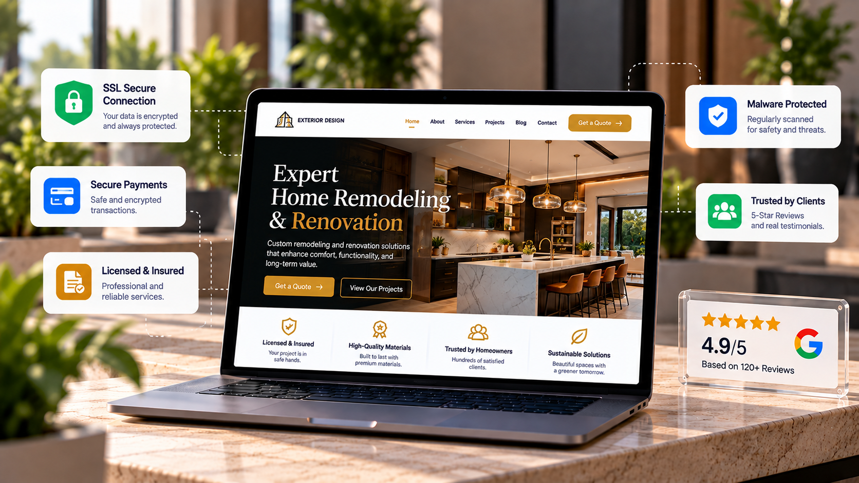
Security protects visitors and your business, while trust signals show visitors the site is safe and legitimate. They matter most on pages that collect personal or payment information.
Trust is fragile. In Baymard's most recent checkout usability study (1,026 US respondents, 2025), 19% of users said they abandoned a checkout in the past three months because they didn't trust the site with their credit card information. Stanford's credibility study also found that information design and structure ranked second, in 28.5% of comments, so a clear, organized site builds trust beyond security badges.
Website design falls into a few main types, and each one is built around a different goal. Static websites use fixed pages and suit simple business profiles. Dynamic websites pull content from a database, so they handle blogs, directories, and frequently updated pages. E-commerce websites are made for selling products online. Responsive websites adjust automatically to any screen size, from phones to desktops. Single-page and landing page designs focus on one clear action, like a sign-up or a call. The right type depends on your budget, how often you update content, and whether your goal is to inform, generate leads, or sell.
Types of Web Designs are:
A static website design uses fixed HTML and CSS files that show the same content to every visitor. It loads fast, costs little to host, and suits simple sites like portfolios and small business profiles that rarely change.
A dynamic website design pulls content from a database and builds each page when a visitor requests it. It is the best fit for blogs, directories, and membership sites that need frequent updates through a CMS like WordPress.
A single page website design puts all its content on one scrolling page instead of spreading it across multiple URLs. It works well for focused goals like booking a call, launching an app, or promoting an event.
A liquid website design sizes its layout in percentages instead of fixed pixels, so columns and images stretch or shrink with the browser window. It was the foundation for modern responsive design and suits content-heavy sites and web apps.
A responsive website design automatically adjusts its layout, images, and text to fit phones, tablets, and desktops. It is the standard approach today, and Google's mobile-first indexing makes it important for SEO.
An e-commerce website design is built to sell products or services online, with a product catalog, shopping cart, and secure checkout. Platforms like Shopify and WooCommerce handle most of the technical side.
A minimalist website design uses white space, a limited color palette, and simple typography to keep the focus on one clear message. It is a style that can be applied on top of any of the types above. Want a deeper look at each option, including pros, cons, and who should choose them? Read our full guide on types of website design.
These three roles overlap, but each has a different focus.
| Aspect | Web Design | Web Development | UX Design |
|---|---|---|---|
| Focus | Look, layout, and feel | Code and functionality | How users experience the product or service |
| Key Skills | Visual design, typography, layout | HTML, CSS, JavaScript, back-end development | Research, wireframing, testing |
| Output | Page designs and mockups | A working website | User flows and usability insights |
In professional development, these fields tend to collaborate, as designers , UX professionals, and developers work together to create a website that meets the need s of users and businesses.
At Expert Design Hub, we have a team of 200+ experts including marketers, developers, designers, and quality assurance team which collaborate to deliver your any project timely and professionally. Looking for website design services? Talk to our experts or get a free quote now.
A web design will influence the way users see your business, how the y interact with your business, and what actions they take on your website.
A good-looking and consistent design builds trust and increases credibilit y and makes people feel more comfortable about your business.
In a 2021 Top Design Firms survey of 500 consumers, 50% said a company's website design shapes their impression of the brand. Stanford's web credibility research points the same way: in a study with 2,684 participants, design look was the most mentioned factor when people judged whether a site was believable.
Clear layouts, simple navigation, and strong calls to action make it easier for visitors to complete important actions by filling out an appointment form, booking a call, buying a product, or requesting a quote.
Clutch's survey of 612 US respondents found that 94% rate easy navigation as the most useful website feature. When visitors can't find what they need quickly, they leave, and every lost visit is a lost lead.
A clear structure, fast-loading pages, responsive design, and accessible content can support a better user experience and SEO performance.
Speed matters most on mobile: Google's research found that 53% of mobile visits are abandoned when a page takes longer than three seconds to load.
In most industries, your competitors are one search away. A modern, trustworthy website helps you stand out, while an outdated or confusing one sends visitors to the next result. Strong design also makes your offer clearer, so visitors understand why you are the better choice.
A well-planned website is cheaper to maintain and easier to grow. Building with a solid structure, clean code, and a flexible design from the start helps you avoid costly rebuilds later and makes it simple to add new pages, services, or products as your business grows.
Websites may be designed in various styles depending on their content, functionality, target audience, and intended business. Some approaches focus on how content is managed and presented, while others focus on visual style, functionality, or adapting the website to different devices.
Some of the most popular styles and design approaches are:
The right approach depends on your website’s purpose, content, audience, and functionality. Some of the approaches may be combined; for instance, an e-commerce website may use both dynamic and responsive designs.
The web design process typically involves five stages, from initial planni ng and wireframing to development, testing, and ongoing maintenance.
Define the business goals, target audience, competing sites, and technical needs of the website. This step provides a foundation for the later stages of the design process.
A wireframe consists of a simplified design of the page layout and content. A prototype adds interactivity and helps teams evaluate how users will navigate and interact with the website.
The approved wireframes are turned into polished page designs using the brand’s colors, typography, imagery, spacing, and visual hierarchy.
The team implements the design in code and tests it across relevant browsers and devices to check functionality, responsiveness, and accessibility.
After launch, regular updates, monitoring, and optimization help keep the website secure, functional, and up to date.
Review the website after launch using analytics, performance data, accessibility checks, and user feedback to identify areas that need improvement.
Six considerations to take into account before developing your website are:
The best tool depends on your project's complexity, your team's skills, an d how much maintenance you expect.
| Tool | Best For | Skill Level |
|---|---|---|
| Figma | Wireframes, prototypes, UI design, and team collaboration | Beginner to advanced |
| Sketch | Interface and product design on Mac | Intermediate |
| Adobe XD | UI design, wireframing, and prototyping | Beginner to intermediate |
| WordPress | Content-driven websites and flexible CMS-based projects | Beginner to advanced |
| Webflow | Visual website building and custom responsive designs | Intermediate |
| Bootstrap | Responsive front-end development with pre-built components | Intermediate to advanced |
By avoiding some common mistakes in designing websites, you will find it easier to operate, speed up performance, and increase efficiency. A cluttered page can distract attention from the main idea or message that you are trying to convey to visitors.
Heavy graphics, unnecessary scripts, and inefficient code can lead to slow loading of the web pages. The website must be responsive and work correctly on desktop, tablet, and smartphone. Each crucial web page must indicate what actions visitors need to take in order to buy a certain product, ask for a quote, submit a form, or contact the company.
Web design integrates visual design, usability, accessibility, and strategy to develop websites that are simple to use and effective in meeting business objectives. Understanding your audience, defining clear objectives, preparing your content, and selecting the correct design approach and tools will help you develop a website that performs well for both users and your business.
1. What is web design?
Web design is the process of planning, creating, and arranging the visu al look, layout, and user experience of a website.
2. Can I design a website on my own?
If it’s a basic website, then yes, you can design a website on your own, but for a complex, multi-page website or an e-commerce store, you need a dedicated company to make it professional and functional on all devices.
3. What's the distinction between web design and development?
The distinction between web design and development is that web design concerns the style and layout of the website, whereas web development involves coding and building a finalized layout.
4. What kinds of web designs are there?
Popular and most-used web design styles include static web design, dynamic web design, responsive website design, minimalist website design, and e-commerce website design.
5. In how much time can you design my website?
The time depends on the website's size, complexity, content, and features. At Expert Design Hub, our team of 200+ experts works in parallel, so small websites are typically delivered in 3-4 days, while larger projects such as custom websites and e-commerce stores typically take 5-6 days. Timelines can extend if content, approvals, or revisions are delayed on the client's side.
6. Does web design affect SEO?
Yes, SEO is important, as website structure, mobile friendliness, speed, accessibility, and navigation are the most important factors for ranking on Google.

Founded in 2016, known for the quality services and proven results.
explore moreIn This Article

SEO
Search Engine Optimization, abbreviated as SEO, is a technical method used to optimize websites to improve their ranking in search engine platforms. The very well-known SEO platform is Google. It can be said that SEO works..
Read more >>
Web Development
Web development covers the creativity and management of websites and web applications. It is all about the practical and logical use of high-level languages, frameworks, and tools to create both the client-side..
Read more >>
Web Design
Discover e-commerce web design costs, the step-by-step designing process, & proven best practices to build a fast, high-converting e-commerce store in the USA.
Read more >>Ready To Take Your Company To the Next Gen?

Contact Us
Fill out the contact form, and we’ll be in touch with you soon to learn more about your business.

Project Discussion
After the submission, we discuss strategy, define the scope of work, and recommend the finest solutions.

Launching and maintenance
Once the project is done and launched effectively, we’ll provide maintenance and support to make sure your brand performs well in the digital world.
A Brand Experience Beyond Compare So Contact Us Today

